CUSTOMER PORTAL PLATFORM
Redesign airplaine leasing web app
Redesign user experience application for planning personnel to provide quick data visualization about the leasing of the airplane.
Project Overview
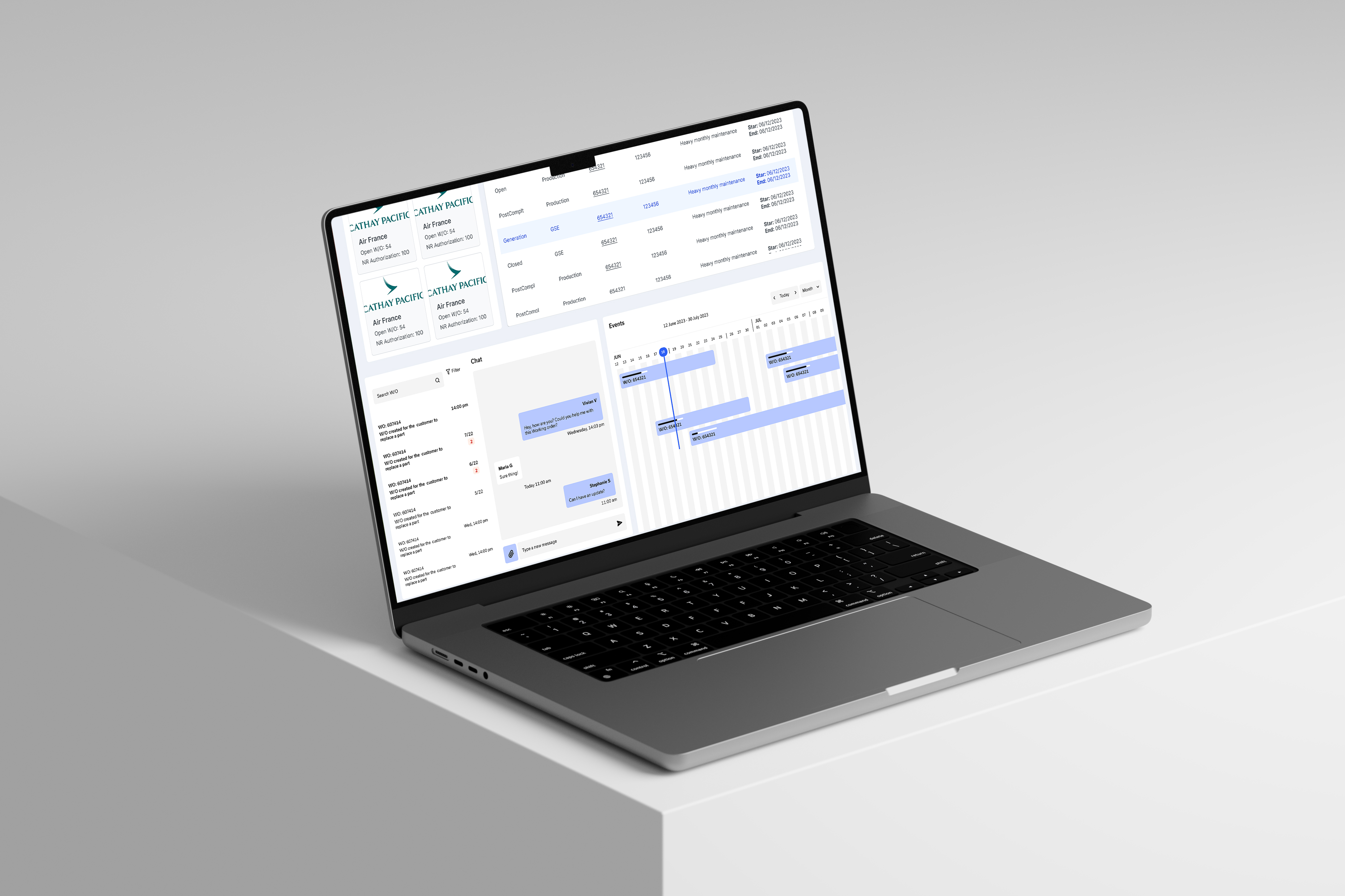
The Customer Portal is a React web application designed for planning personnel to manage the leasing process of airplanes and provide customers with information about any necessary maintenance. The goal is to revamp the dashboard to display key information regarding the status of leases, contracts, and the current stage of the aircraft.
Problem
Navigation and Clarity Issues
- The overall layout is difficult to navigate, and icons and labels do not clearly represent their intended functionality.
- The information presented on the dashboard is not easily understandable at a glance, which leads to a lack of confidence in using the dashboard without instructions.
Lack of Data Visualization
- The design provides minimal data visualization, making it hard to digest complex information and hindering swift decision-making.
- The dashboard is cluttered with static data, which can disengage users and limit their exploration.
- Poorly designed visuals offer little guidance, making it difficult to identify key insights.
Solutions
Improve Accessibility
Create an interactive menu bar to easily navigate the website's main features and increase confidence when navigating the app.
Enhance UI Consistency
Develop well-designed data graphics to reduce cluttered static data, making it more dynamic and improving decision-making.
Goals
Design a user-friendly navigation that allows users to easily find key insights, minimizing cognitive loads when interacting with the dashboard.
Create a dashboard to improve decision-making processes and enhancing user engagement.
Research
To understand how planning personnel interact through management leasing and non-leasing software, I conducted interviews with end users to gain clear insight into their concerns about managing big data and how they stay organized.
Interviews
I conducted five one-on-one interviews to evaluate the app's interface, with a focus on understanding user needs and behaviors. Participants completed tasks related to navigation, which included locating relevant information about the status of the aircraft, the leasing contract, and communication between users and the vendor. This helped identify usability challenges within the app.
Question
Inconsistent Visual Design
- What tools do you use daily?
- How long does it usually take to find specific data?
- How helpful is the dashboard for overview key information?
- What’s the most important feature for finding data on the website?
- What key objectives do you have for this website?
- Are there tools you wish were available for better aircraft leasing management?
- Is it easy to distinguish critical data from less important information?
- Does the app design save you time, or does it add more work?
- If you could redesign the dashboard, what changes would you make?
Not quick access to get into an information.
Insights
Inconsistent Visual Design
- Users find it challenging to locate leasing contract details due to navigating multiple screens and excessive information, leading to frustration and inefficiency.
- There is a strong preference for a consolidated view that displays essential information—like aircraft status and contract expirations—at a glance. A simplified interface would enhance workflow efficiency.
- The app's outdated layout creates navigation challenges and reduces user engagement. Users face a lack of clarity in some areas and encounter non-functional sections, which heighten cognitive load.
- Users experience inconsistencies in app functionality, chips away their trust and making it difficult to complete tasks efficiently.
Not quick access to get into an information.
Persona
Our primary users are planning personnel who manage large amounts of data daily. We aimed to understand how they handle this data, monitor aircraft, and assess the effectiveness of their management when planning for various timeframes, including daily, weekly, monthly, and yearly schedules.
This user persona helps us gain insight into the needs and behaviors of our target audience. It serves as a tool to simplify tasks, inspires our creative process, and supports our goal of enhancing both user experience and visual design.
Olivia Peterson
Age: 35
Job Title: Aircraft Leasing and Maintenance Planner
Experience: 8 years in aviation planning and operations
Location: New York, USA
Personality
- Detail-Oriented: Olivia pays close attention to details to prevent mistakes.
- Efficient: She utilizes time-saving tools to stay organized and prioritize important tasks.
- Proactive: Olivia anticipates potential issues, especially related to contract renewals and aircraft maintenance.
Goals
- Manage aircraft leasing contracts to ensure timely renewals, monitor expirations, and maintain compliance.
- Track aircraft status and maintenance schedules in real-time to avoid delays or safety risks.
- Streamline workflows by reducing manual data entry and minimizing navigation between systems.
- Stay on top of lease and maintenance deadlines to avoid missing important validations or inspections.
Workflow
Olivia's daily tasks involve checking leased aircraft status for maintenance, reviewing contracts and expiration dates, communicating with vendors about renewals, and updating reports on aircraft status and leasing agreements.
Software Needs
Olivia needs a centralized dashboard that consolidates aircraft status, leasing contracts, and maintenance schedules. It should feature automated alerts for important dates, an intuitive interface for easy access, and organized data to highlight critical metrics for quick decision-making.
Quote
"I need a streamlined dashboard to manage aircraft leases and maintenance, with all key data in one place."
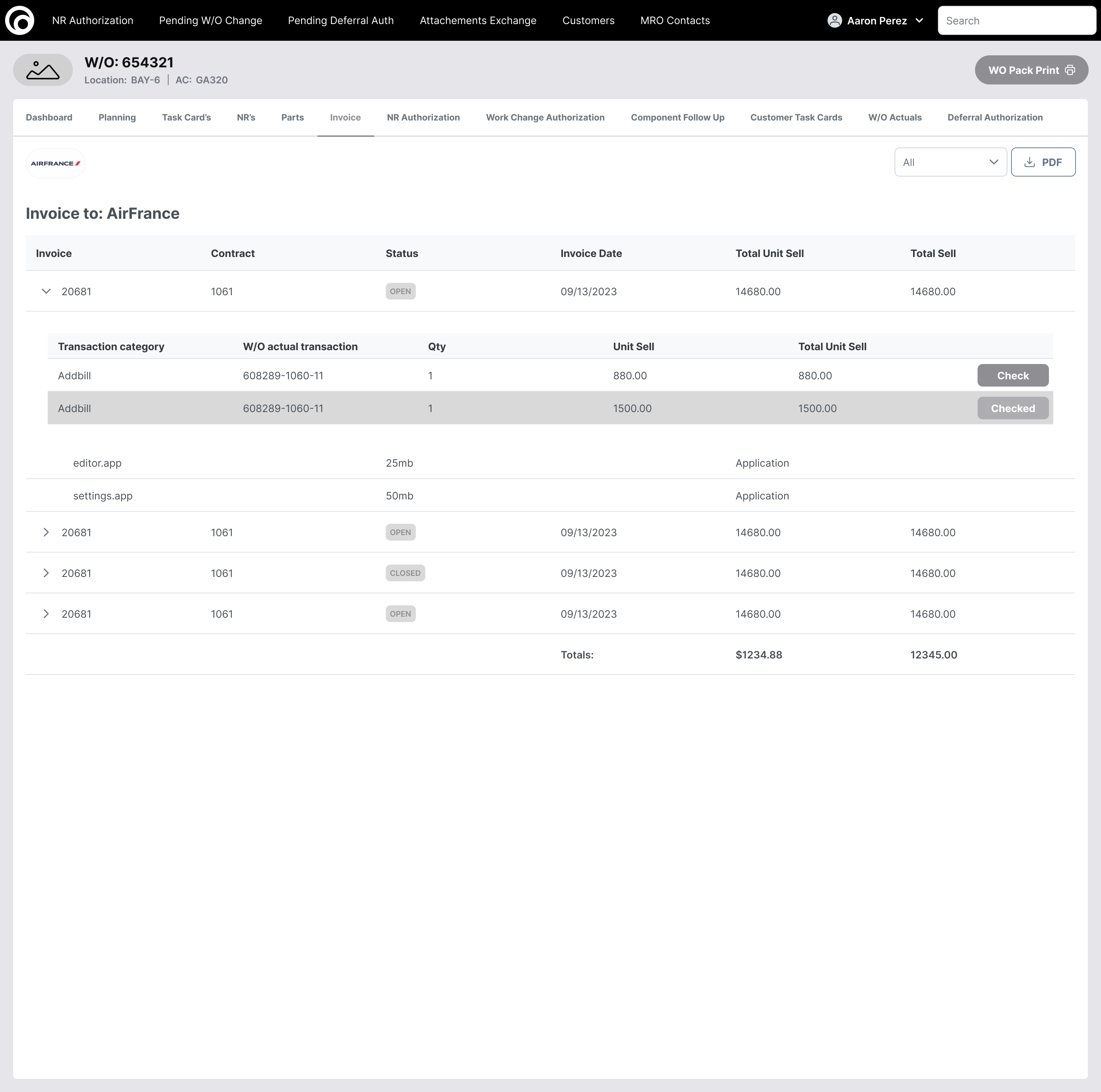
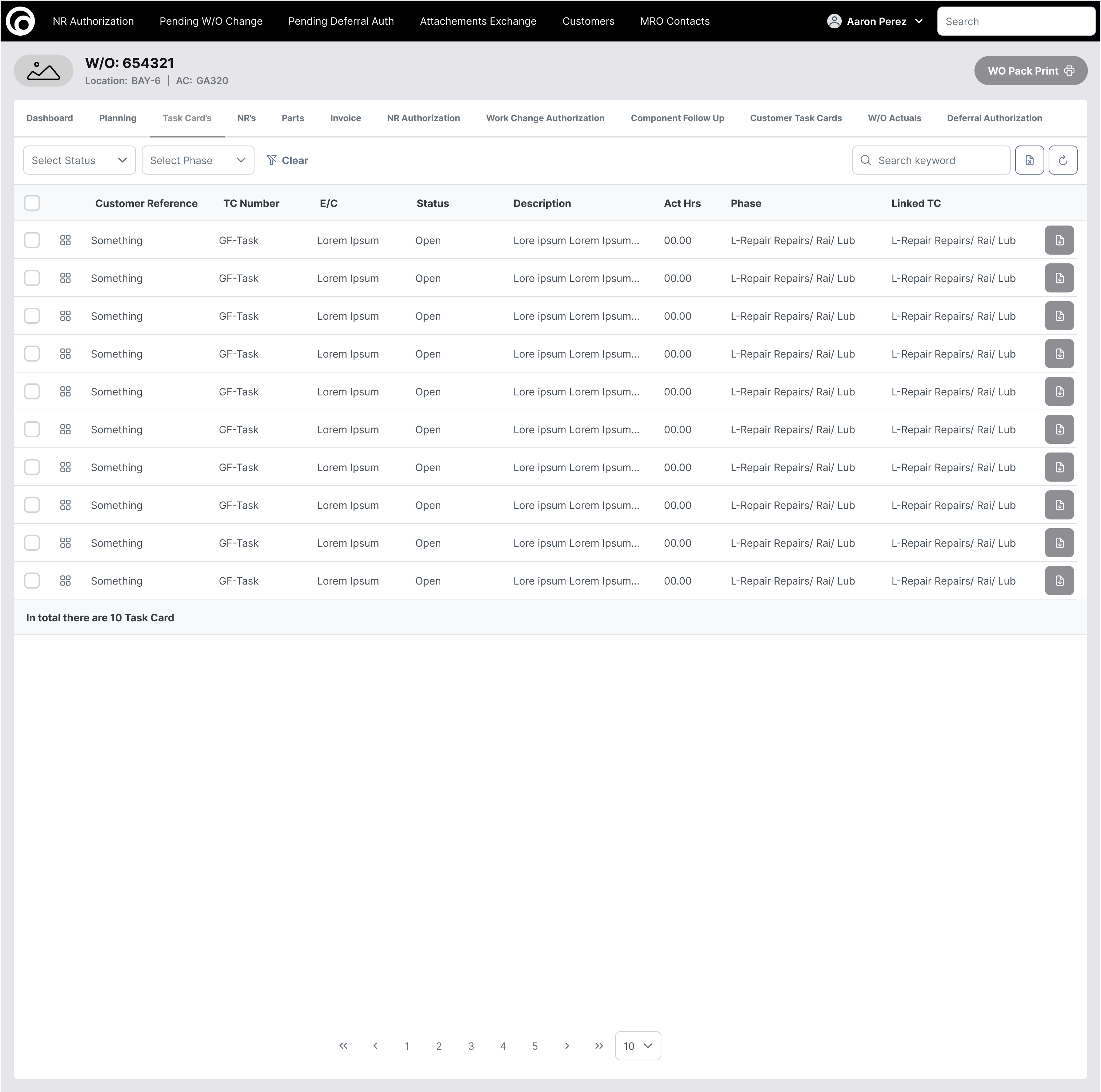
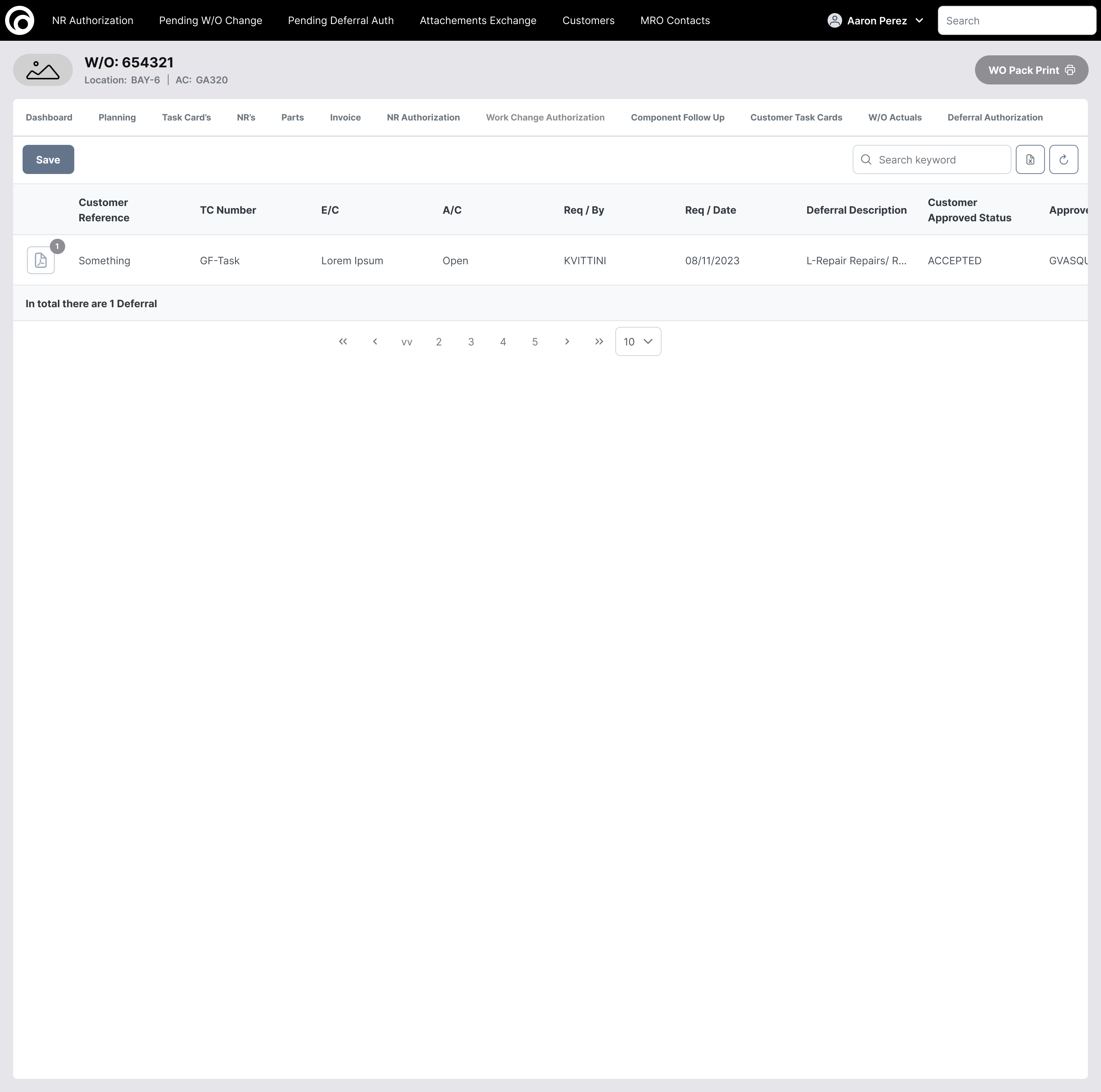
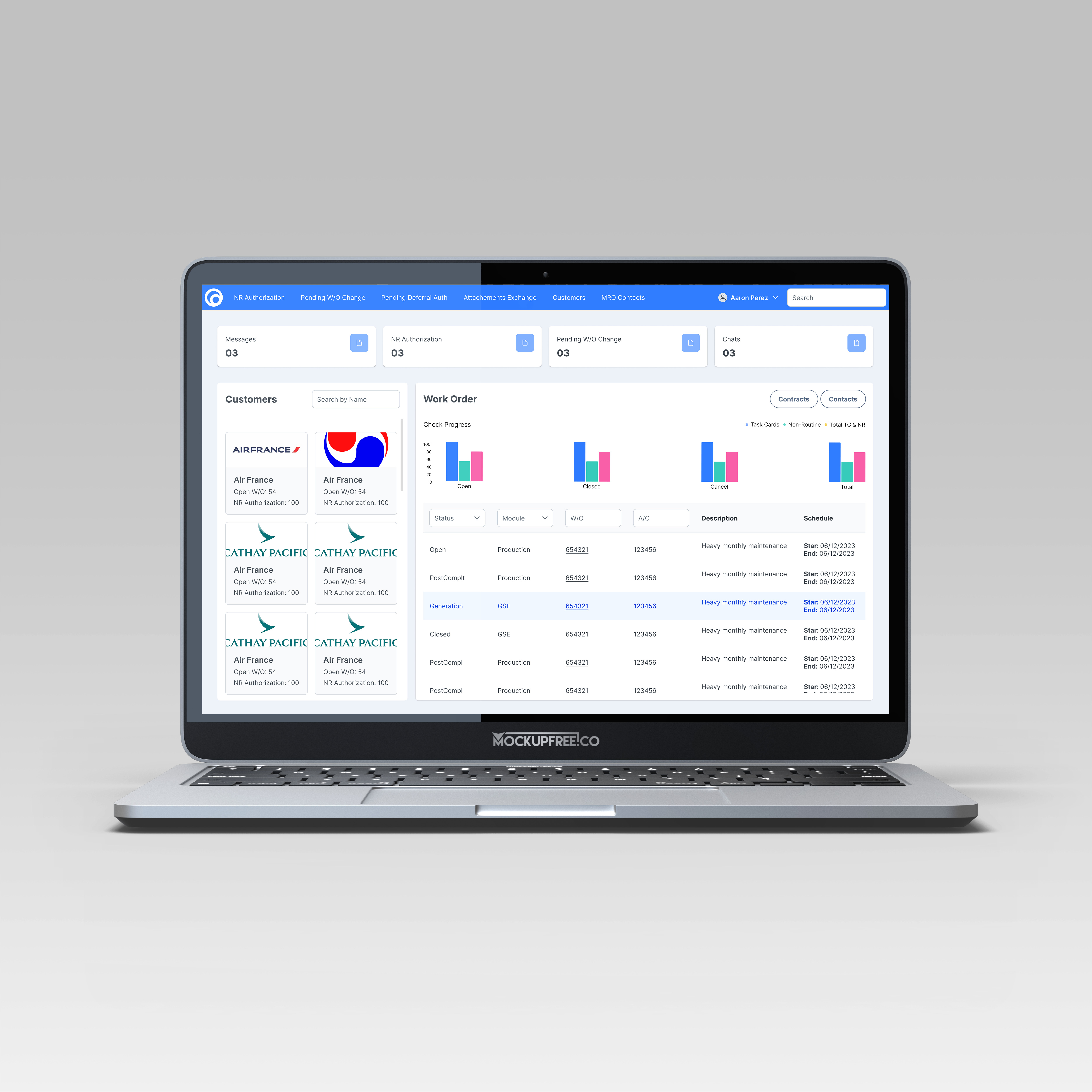
Wireframes
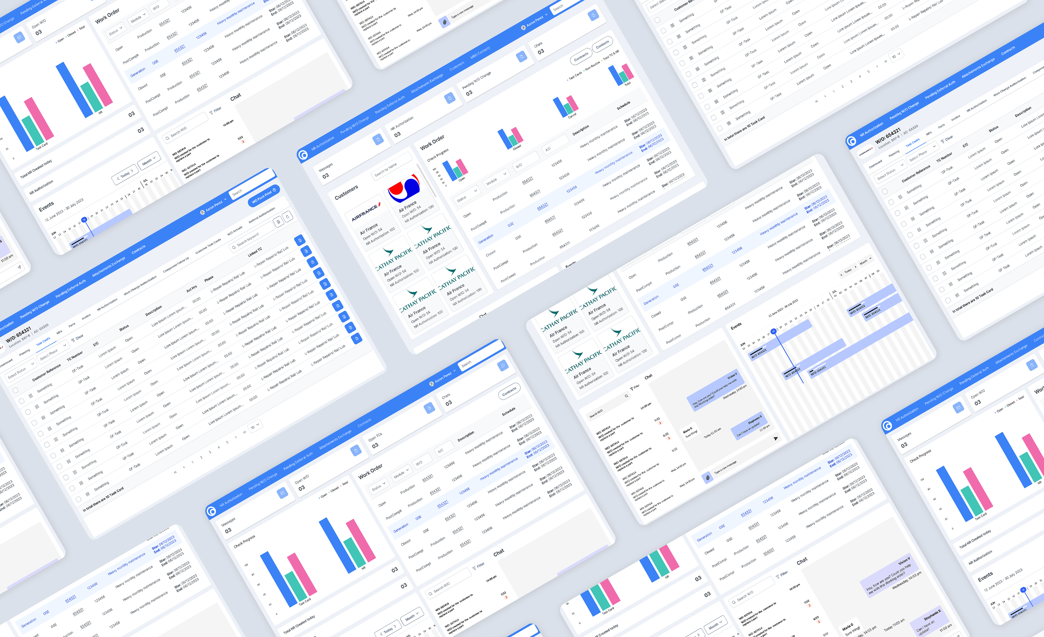
During this process, I focused primarily on narrowing down the most important data visualizations to help users quickly scan information and facilitate faster decision-making while capturing any important updates. Additionally, I revamped the menu bar to improve the website's interaction, making it easier for users to locate relevant features and navigate the site.
End Results
Over the past five months, I have worked with product specialists and stakeholders to analyze the shortcomings of the previous design in meeting user experience standards. This process involved conducting multiple interviews and using the card sorting method with planning personnel and product specialists to identify and categorize the most important information to display, ensuring it is easy to digest.
Reflection
Key Takeaways
As users work with large amounts of data across various platforms, it’s vital to create an intuitive environment that saves them time. By minimizing cognitive load and presenting complex data in clear formats like charts and graphs, users can easily spot trends and insights.
Our redesigned dashboard features improved readability and streamlined navigation, including graphics, a menu bar for key sections, and a search bar for quickly filtering aircraft. This approach has increased task completion by 50%, significantly boosting user efficiency and productivity.
What did I learn?
This experience highlighted the importance of creating an intuitive environment that supports users in handling complex data. Managing large amounts of information across multiple platforms can be overwhelming. By analyzing the website's structure and identifying key areas for valuable information, I aimed to provide interactive feedback that helps users stay focused, promotes productivity, and saves time.
Future Consideration
My next strategic focus is to adapt the same strategy to the upcoming pages and enhance feature interactions. I plan to brainstorm ways to improve the reading of complex data tables and collaborate with users to gain insights about desired features that should be implemented on the website.

%202.0%20-%20Default.png)